
We’ve all had that teacher, lecturer, instructor, or seminar presenter who lost us within the first couple of minutes of their presentation. Perhaps you worked hard at paying attention, but the complexity, monotone delivery, PowerPoints filled with text, or flat out boring material made you lapse into a coma.
Text has a propensity for becoming that boring presenter. We tend to scan and shy away from large blocks of text. Why, because we work to process information in the most efficient way with as little effort as possible and when faced with a page full of words our brains want to just run and hide. Our brains continually attempt to reduce cognitive load and we can ease their burdens by presenting text in a way that allows for efficient processing.
Keep in mind that reading on a screen is very different than reading printed material. I can’t emphasize this point enough. I admit my guilt in simply dumping textual material formatted in MSWord into my online courses, as I’m sure many instructors have done. Designing for conveying information on a computer screen is a different animal than designing for printed material and requires some additional planning.
Consider using the following guidelines for presenting text in your online courses.
Keep it Clean and Simple
Sometimes
instructors tend to get a bit wordy when writing content. Hey, I'm guilty of
this one as well and my disappointment over students not reading every word of
my carefully crafted prose is shared by many other academics.
In his
excellent book on usability, Don’t Make
Me Think, Steve Krug came right to the point when he wrote:
“Happy Talk
Must Die”
Happy talk
is very alive and well in academics. You might remember the old Peanuts
cartoons where Charlie Brown’s mom is giving a lecture and all he hears is
“whaw…wha..wha..wha.” Reading Happy Talk produces similar sounds in your brain.
I completely
understand that academics is all about accuracy, and there is a place for
lengthy course descriptions, 20-page syllabi, and extremely accurate but wordy
prose. The problem is that few students read these well-crafted materials.
Think of all of the legal agreements associated with websites we happily click
on the “I agree to the terms” statements without reading.
Reducing
happy talk will make your students happy. Bombarding them with pages and pages
of text will create stress and confusion and increase cognitive load.
Break Up Large Amounts of Text
Break up large textual passages by presenting bolded headings followed by smaller chunks of text. The following images show how a lengthy textual document can be broken up into more readable segments.
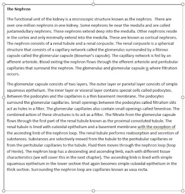
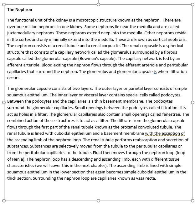
Here is a scary block of text with one heading.
We can break up this block by adding mulitple headings (better).

We can also create statements followed by summary links to more information (even better).

Or, we can just use links for the entire document allowing the reader to choose what to read (way better).

Fonts
Let’s talk about fonts. We might remember the default MSWord Times New Roman font. Times New Roman is called a serif font. Serif fonts have small lines attached at the end of a stroke. Sans serif fonts such as Arial do not have these tiny additional lines (see figure 2.5). So the question is…which is easier to read?

There is no clear cut answer to this. For years it appeared that people preferred serif fonts for reading printed text but there seems to be a recent trend toward a preference for sans serif fonts for reading computer screens. For online courses my preference is using sans serif fonts.
Use at Least a 12 Point Font
How big should the font be? That depends on what kind of information you wish to present. Headers or beginnings of sections would have larger fonts than body text. The minimum font size should not be less than 12-point font. The next image has some examples of different font sizes for various purposes.

It's also preferable to use common fonts. Not only do we recognize these fonts, but they also load faster. Browsers need to have the font installed so using common fonts like Arial, Helvetica or Veranda will appear more uniform across browsers.

High contrast backgrounds work best for elearning.

Bold, Italics, Underline
Bold can be used to draw attention to a word, phrase, sentence or heading when needed but should be used sparingly. Research shows that users look at bold font up to 4 times longer than regular font.
You can use italics to draw attention to words. Like bold, use italics sparingly. Don’t use italics in headings but you can use them in the body of text for emphasis.
Use underlining only to emphasize links. This is a common web convention.
Don't Use More Than 2 Ways to Highlight Information
This may relate more to graphs and charts versus pure textual information. Some of these items contain multiple methods for ranking information such as colors, bars, numbers, and so on. Try to keep it simple when it comes to highlighting information.
Use Line Lengths of 50-75 Characters
To make text more readable, use an optimal line length of about 50-75 characters. Short line lengths cause excessive eye movements, as the reader’s eyes must shift from the end of one sentence to the beginning of the next. Long line lengths cause readers to lose focus on text since it is more difficult to determine the beginning and end of the line. If you can’t get your line lengths down to 75 characters, then it is better to err on longer line lengths since people tend to prefer these over shorter line lengths.

Be Consistent
Once you determine your basic design parameters, you should work to maintain consistency throughout your course. For example, title pages with instructions should have the same look, line lengths, and organization as well as the rest of the course. There is a learning curve with regard to understanding the information flow for each course. Once students achieve this it is best to stick with your original design throughout the course.
For more information, visit my site:
https://www.drbruceforciea.com
Break up large textual passages by presenting bolded headings followed by smaller chunks of text. The following images show how a lengthy textual document can be broken up into more readable segments.
Here is a scary block of text with one heading.
We can break up this block by adding mulitple headings (better).

We can also create statements followed by summary links to more information (even better).

Or, we can just use links for the entire document allowing the reader to choose what to read (way better).
Fonts
Let’s talk about fonts. We might remember the default MSWord Times New Roman font. Times New Roman is called a serif font. Serif fonts have small lines attached at the end of a stroke. Sans serif fonts such as Arial do not have these tiny additional lines (see figure 2.5). So the question is…which is easier to read?

There is no clear cut answer to this. For years it appeared that people preferred serif fonts for reading printed text but there seems to be a recent trend toward a preference for sans serif fonts for reading computer screens. For online courses my preference is using sans serif fonts.
Use at Least a 12 Point Font
How big should the font be? That depends on what kind of information you wish to present. Headers or beginnings of sections would have larger fonts than body text. The minimum font size should not be less than 12-point font. The next image has some examples of different font sizes for various purposes.

It's also preferable to use common fonts. Not only do we recognize these fonts, but they also load faster. Browsers need to have the font installed so using common fonts like Arial, Helvetica or Veranda will appear more uniform across browsers.
Back in the
good old days of the internet, there were all sorts of fancy fonts and colorful
backgrounds. We still see examples of backgrounds containing flowers, scenery,
people, and so on in some websites. I remember designing some early websites
with what I thought were really cool backgrounds. Why? Because I could. I gave
little thought to usability back in those days. Today, you may have noticed
that websites have really cleaned up their acts. Easy to read text on plain
backgrounds with minimal interfering images reduces cognitive load and makes it
easier to get the message into our brains.
When it
comes to reading on computer screens contrast is key. Contrast is the
difference between the lightest and darkest areas on a page. In the case of
fonts, the contrast is the difference in brightness between the font and
background. You should present text information using high contrast designs.
Good ole black text on a white background works great. Use colored backgrounds
to present blocks of information organized according to groups but keep
contrast high.
Avoid using
background images and patterns. Images and patterns make reading text more
difficult. Plain backgrounds work best.
Black
backgrounds with white font (reverse text) present a more dramatic look but are
difficult to print and are more difficult to read, especially for long passages
of text.
Once you
choose a font and background, be sure to remain consistent throughout your
course. Pages should contain the same layouts with the same font style, size
and backgrounds.

High contrast backgrounds work best for elearning.

Bold, Italics, Underline
Bold can be used to draw attention to a word, phrase, sentence or heading when needed but should be used sparingly. Research shows that users look at bold font up to 4 times longer than regular font.
You can use italics to draw attention to words. Like bold, use italics sparingly. Don’t use italics in headings but you can use them in the body of text for emphasis.
Use underlining only to emphasize links. This is a common web convention.
Don't Use More Than 2 Ways to Highlight Information
This may relate more to graphs and charts versus pure textual information. Some of these items contain multiple methods for ranking information such as colors, bars, numbers, and so on. Try to keep it simple when it comes to highlighting information.
Use Line Lengths of 50-75 Characters
To make text more readable, use an optimal line length of about 50-75 characters. Short line lengths cause excessive eye movements, as the reader’s eyes must shift from the end of one sentence to the beginning of the next. Long line lengths cause readers to lose focus on text since it is more difficult to determine the beginning and end of the line. If you can’t get your line lengths down to 75 characters, then it is better to err on longer line lengths since people tend to prefer these over shorter line lengths.

Be Consistent
Once you determine your basic design parameters, you should work to maintain consistency throughout your course. For example, title pages with instructions should have the same look, line lengths, and organization as well as the rest of the course. There is a learning curve with regard to understanding the information flow for each course. Once students achieve this it is best to stick with your original design throughout the course.
For more information, visit my site:
https://www.drbruceforciea.com
Comments
Post a Comment