
Image from: https://commons.wikimedia.org/wiki/File:2018WDSprint_paper.jpg
Here is a small project in which I was asked to apply an LMS style guide I developed to an existing online course. The goal was to decrease cognitive load by applying some simple principles of usability to this course.
Let's begin with the opening page of the course. This is what students see when they first access the course.

The LMS is laid out according to usability guidelines. The home page contains the course title (not shown) and navigation menu in an F-shaped pattern. The opening text welcomes the students to class. The instructions are as follows
"Please read the course Syllabus first. It contains information about course expectations, supplies and evaluation standards. NOTE: Some assignments have due dates and require group (team) work, and some courses vary in length.
Dedication and time management skills are required to complete this course. You must motivate yourself to finish Performance Assessments in a timely manner. This course begins on [month] [date], [year] and ends on [month] [date], [year]. It will be important to communicate with the instructor any difficulties you are experiencing with the course."
The instructions direct the student to read the course syllabus first. However, there are no instructions beyond reading the syllabus to continue in the course. Students would need to spend time and clicks to determine what to do next, or which assignments to complete. The remaining instructions (dates to be filled in by the instructor) warn the student about using time management skills. I could see where some students could interpret this as a negative message.
The graphic is nice, but does not contribute any relevant information to the course.
Here is the redesigned opening page:

A short, introductory video was added along with the instructions to begin the course by viewing the video. The closed captioned video covers how to navigate the course and where assignments and due dates are found.
The instructions below the video were changed to the following:
"Read the course syllabus by clicking on the Syllabus link on the left side of the course.
NOTE: Some assignments have due dates and require group (team) work, and some courses vary in length.
This course begins on [month] [date], [year] and ends on [month] [date], [year].
It will be important to communicate with the instructor any difficulties you are experiencing with the course.
After reading the syllabus, visit the announcements section for important information from your instructor.
Then, begin the course by working through the modules."
Line lengths were shortened and text was spread out to facilitate reading. Clear instructions were added directing the student to the next step in the course. The warning about time management was removed.
Now, on to the first learning module.
Here is the "before" image of the first module:
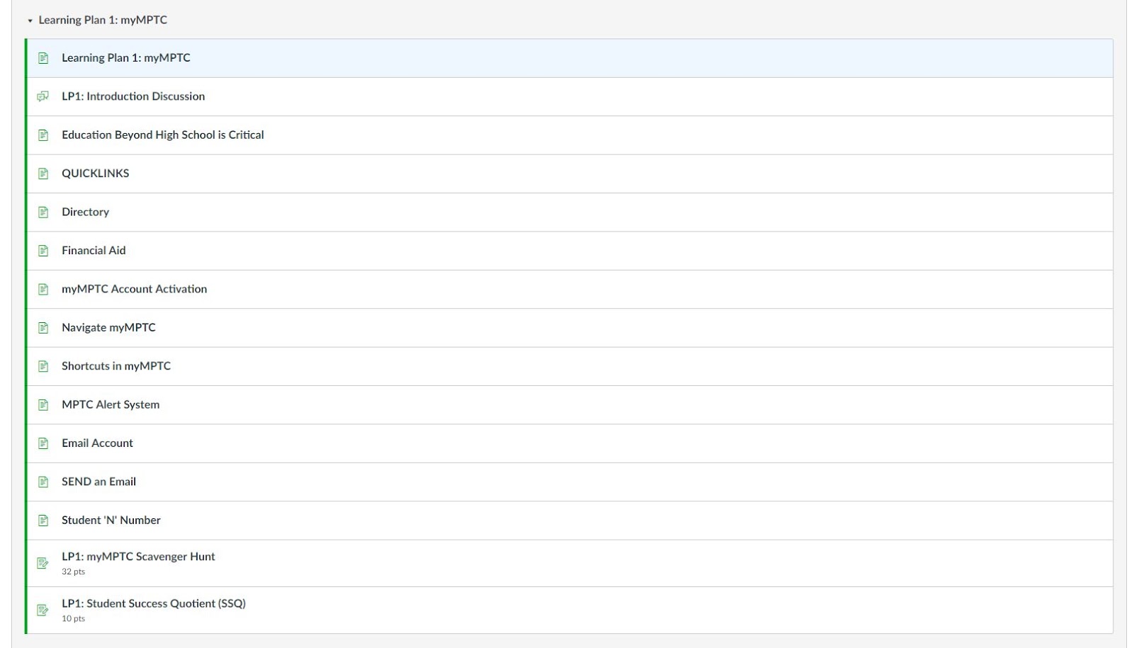
Here the student is given a long list of pages and activities to open and complete for the very first module.
Here is the redesigned first module:

A good portion of the information was condensed so create a less overwhelming look to students.
When students opened the first page in the module, it looked like this:

The page contained a lot of information about course competencies, learning objectives, and criteria for achieving proficiency of competencies. Great information for curriculum, but could be confusing to students who want to know what to do next.
The redesigned version:

All of the competency/learning objective information was removed and put into a separate page in the opening module, making it optional for student viewing.
Much of the information on the following separate pages was integrated into this page. The page now steps students through the activities using images (versus all text in the previous version) with highlighted sections.
Text was also optimized by making it larger and using shorter line lengths.
So, by making just a few improvements, students should find the course much easier to navigate (reducing cognitive load) and have less questions for the instructor.
Comments
Post a Comment